What Are Mobile UI/UX Patterns?
Posted by Davzo Inc
Posted in Design
User-interface/User-experience (UI/UX) design patterns are formalized best practices that app designers and developers use to overcome design challenges and create better apps. The purpose of such patterns is to streamline app design by helping app developers build apps that strike a fine balance between functionality and ease of use. Because the best apps are straightforward and user-friendly, design patterns are an integral part of all successful iOS app development projects. If you intend to develop an iOS app for your business or startup, understanding what design patterns are and how exactly they work can help you come up with a more intuitive design for your app.
The Benefits of Design Patterns
App designers and developers use design patterns because of the many benefits they bring. When implemented well, design patterns...
- Create a sense of familiarity which makes even new apps easy to understand
- Improve screen space usage and reduce clutter
- Streamline the app design, increasing the app’s user-friendliness
- Help users find their way around the app with greater ease, reducing the number of taps they have to make
- Provide feedback on application status and error prevention
iOS Design Patterns
Although the same broad design patterns can be applied to every mobile platform, every platform ultimately has its own unique structures and requirements. This is certainly true of Apple’s iOS. iPhone and iPad users have come to expect certain design elements and features that are consistently present in all top apps, and which improve the user experience and decrease the app learning curve. Design patterns help to implement these iOS-specific design elements into new apps. For this reason, if you want to develop an iOS app, it’s crucial to work with an iOS app developer that fully understands the power of design patterns and uses them in their projects.
Key iOS Design Patterns
Discovering a few essential design patterns used in the development of popular iOS apps for the iPhone and the iPad can inspire you to follow the right design patterns for your own app.
Action Bars One of the most widely used design pattern is action bars, which have become a regular feature of all varieties of apps, from Internet and social media apps to utilities and productivity apps. Simple in their design but extremely effective, action bars draw the user’s attention to the key actions on the app, presenting them in a clean, clutter-free way that improves the overall design and reduces distractions.
Because almost all iOS apps feature action bars at the top of the screen, iPhone and iPad users have become familiar with seeing action bars in their apps. If your app does not have an action bar, it may confuse users, who will be left wondering what to do or what button to press to start using your app’s features. Here is an example of an iOS action bar compared to an Android action bar in the Vine app. As you can see, there are quite a few differences, most notably iOS’s the central alignment of action bars and branding.

Social Login
Another key iOS design pattern is the social login screen, which provides users with a quick and effective way to log into your app by using their Facebook, Google+, or Twitter username and password. Social login integration into your app spares users the trouble of having to create yet another online account, and also makes sure they don’t forget their username or password combination. Even more importantly, the social login design pattern reduces security concerns and streamlines the app login process, by eliminating the need for users to type in the details of a new login.
Another benefit of the social login is that it allows you to obtain some essential data about your users, such as their age and location, which you can use to better understand your audience, as well as to optimize your app’s features for core users. Here’s an example from the SlideShare app, which offers two social login options, one for Facebook and one for LinkedIn.

Big Buttons
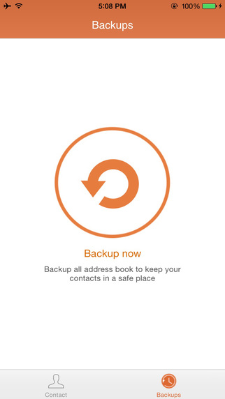
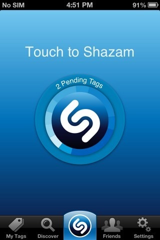
Large buttons help emphasize specific actions. Many apps are using large buttons to draw attention to a specific feature, as well as to add simplicity to the design. Huge buttons work especially well with one-pointed apps such as cache cleaners or music recognition apps, which have just one feature. For such apps, a large button placed on the main screen of the app is simply the best approach to maximizing usability. Large buttons may be useful for your app as well. Just look at the examples below and you will understand:
Notifications
Notifications provide updates about recent activities within an app. They can be social, as when someone likes or comments on your Facebook page, technical, as when a new app upgrade or plugin has become available, or it may remind users to do a backup. Notifications have become an integral feature of many top apps, not just social ones, which is why an adequate implementation of notification design patterns is important for your own app. Good notifications highlight new activity in a conspicuous way, without however interfering with the flow of the app. Notifications can be implemented in different ways, as highlighted by the apps below:


Hidden Controls
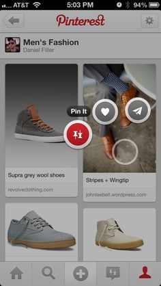
Some apps come with controls which are useful only when certain features are used. Placing all the controls of an app on the same screen can create some serious clutter, eating up all screen space, so instead web developers rely on the hidden controls (or contextual controls) design pattern, to place them off screen. In order to conjure these buttons, users have to swipe, tap, or long-press certain elements on the screen. Unless it’s very basic, your app probably needs hidden, contextual controls implemented into it. Here are a few examples to illustrate hidden controls. With Pinterest, long-pressing on an image creates a pop-up that lets you Pin, Heart, or Share it. It’s a simple solution to free up screen real estate.
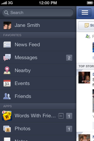
With Facebook, you can tap on the menu icon to access the menu with extra features.
More than design practices that assist app developers, design patterns are ultimately powerful guidelines that ensure your iOS app is user-friendly and provides a rich user experience. Adhering to them is a sure way to develop a more intuitive and better app all round. Regardless of the type of app you want to develop, choosing an iOS app developer that knows how to handle design patterns can dramatically improve the result.
We believe that using design patterns is one of the keys to building great iPhone and iPad apps.
Have An Idea For an Apple tvOS App? Don’t Start Before You Read This
Making its first appearance in the 4th generation of the Apple TV, tvOS is an iOS-inspired operating system optimized for the large screen. Thanks to tvOS, you can now create dedicated apps for
How Much Does It Cost To Develop an iOS App?
If you had to buy a smartphone, which one would you choose: a smartphone that costs $100 or $1000? Obviously, the price you are going to pay highly depends on what you expect to get. The same i
Does iOS HomeKit Have What It Takes To Win The Smart Home Market?
The smart home market is expected to grow to a whopping $58.68 billion by 2020, according to the Smart Homes Market - Trend and Forecast to 2020 report. That’s not surprising when you consider